Campbell's Soup's Tiny Medal Has a Huge Story — Why No One Noticed for 124 Years
コンサベーション・スープの小さなメダルに隠された大いなる物語——なぜ124年間誰も気づかなかったのか
www.thetakeout.com
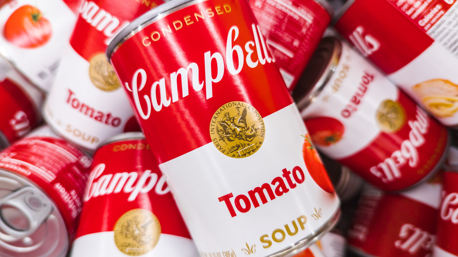
Campbell’s iconic red-and-white can has remained virtually unchanged for over a century — not because marketing teams were lazy, but because that tiny medal in the center commemorates a real bronze award from the 1900 Paris Exposition. It’s not just decoration; it’s a century-old flex. And honestly? Most of us never even squinted hard enough to decode it.
キャンベルのアイコニックな赤と白の缶は、実に1世紀以上ほとんど変わっていない。マーケティングが怠慢だったからではなく、真ん中の小さなメダルが1900年のパリ万国博覧会で得た実際の銅メダルを記念したものだからだ。ただの装飾ではなく、100年以上続く「自慢」である。正直に言うと? ほとんど誰も、それをしっかり読み取るためにじっと見たことすらなかった。
The medal was designed by J.C. Chaplain, sculpted by the Paris Mint, and features a winged victory holding a torch-bearing champion. It’s literally a trophy on a soup can. And yet, when Campbell’s slightly redesigned the label in 2021, all the internet could talk about was the shrinkage of the text — not the enduring legacy of a design that quietly screamed 'We won'.
そのメダルはJ.C.チャプレイがデザインし、パリ造幣局が制作したもので、トーチを持つ勝者を運ぶ翼のついた勝利の女神が描かれている。まさにスープ缶に貼られたトロフィーだ。それにもかかわらず、2021年にキャンベルがラベルを微調整した際、ネットで話題になったのは文字の縮小だけであり、「我々は勝った」と静かに叫ぶこのデザインの持続的な意義には誰も触れなかった。
多くの老舗ブランドはパニックになり、現代化しようとするが、キャンベルはひっそりとマーケティングの基本を守り続けている。このメダルはノスタルジーではなく、長年にわたる優れた品質の証なのだ。『カッコいい』になる努力をしていない。すでにアイコニックなのである。
現実を見よう。あのメダルはあなたが無意識にその製品を信頼するように仕向ける。権威、伝統、外国からの承認マークを連想させるのだ。スープ缶のシンボルに感情操作されているのか? その通りだ。そして、効いている。
あのメダルのあらゆる構成要素——対称性、翼のついた比喩的人物、月桂冠——が古典的な権威を主張していることに気づいただろうか。偶然ではない。国家のメダルや国章、古代帝国のビジュアル言語を借りているのだ。
でも2021年のリデザインでロゴは確かにシャープになったし、トマトスープの缶にトマトが描かれたのは? 棚での識別性が格段に上がる画期的な変更だ。
ウォーホルの空白の円形版は天才的だった。彼はメダルが持つ権威的な意味を取り払い、反復と消費主義、そして日常の中に潜む美しさだけを残した。メダルなんてどうでもよかったのだ。大事なのは缶そのものだった。
つまり1900年に銅メダルを取ってから120年以上それに甘んじてきたってこと? 慣習が停滞を正当化すると考えるあらゆる老舗ブランドの言い訳みたいだ。
過去の名声に頼るというのは革新が止まった状態を意味するが、キャンベルは革新をやめていない。ただ、缶のデザインを変える必要がなかっただけだ。停滞と賢明な一貫性には違いがある。